Victoria’s craft breweries employ artisans to hand-craft some of the best brews around, but that philosophy goes further than their beers — they’re making their labels (and more) with the same principles.
Phillips Brewing
Tucked in the back lot of Phillips Brewing Co. sits a sea can chock-full of art supplies. This is the “Imaginarium,” or “Part D’Artment” — home to Russell Papp (russellpapp.com) and Chris Dobell (dobelldesigns.blogspot.ca), two of three artists employed by Phillips.
While Papp and Dobell don’t create labels, they’re in charge of another face of Phillips — crafting custom creative centrepieces like the “Gypsy Wagon,” a 36-foot gypsy caravan-inspired refrigerated trailer with 32 beer taps that was the focal point of last year’s Rifflandia beer garden.

They also create custom-designed signage for Phillips’ clients and other promotional materials.
“When a customer sells a certain number of kegs, they get credit from our department,” says Dobell. “Russ and I will create custom, personalized, hand-painted signage for their establishments instead of something made by a machine.”
“I’m in charge of everything that’s three-dimensional,” says Papp. “And I do the painting,” adds Dobell.
For example, Papp will cut out a sandwich board and Dobell will liaise with the customer to create a custom work, suited specifically to the venue. Dobell, a second generation Australian sign-painter, is one of the only artists practising his craft in Victoria.
Walk into almost any pub in town and it’s easy to spot Papp and Dobell’s work. The signs have a distinct appearance, blending traditional sign-painting with contemporary and street-art style.
“It can be so rewarding to take a piece of wood and turn it into a piece of art,” says Dobell. “It’s keeping the craft alive.”
The third member of the Phillips “Part D’Artment” is Shawn O’Keefe (shawnokeefe.blogspot.ca), the graphic designer and illustrator responsible for designing Phillips’ labels since the company began brewing 10 years ago.
“I would guess I’ve designed at least 75 labels,” says O’Keefe, who works on contract but spends around four days a week at the brewery.
“When it comes to the labels, there’s tons of artistic freedom. Matt (Phillips) has a vision for certain projects, but when it comes to design he lets me do what I want for the most part. He’s easy to please, but then again, I know what he wants,” he says with a laugh.
“The art on the label is the consumer’s door to the product if they don’t already know the brand or the brewery. After you open it, it’s the product that sells them. Luckily, I feel fortunate that both work together really well. My label brings them in, but it’s the beer that brings them back.”
And the management agrees.
“A lot of what the art brings to the beer is the culture of the brewery,” says Matt Lockhart, communications and events coordinator at Phillips Brewing Company. “Who we are really informs the styles of the beer and how we approach making beer, and it only makes sense to extend that culture to the look or the branding of the beer. It’s the same personality expressed in a different way.”

“The label is such an important means of expression that it only makes sense to have a group of people who are charged with infusing that personality into all parts of the points of contact with our customers.
It would be easy to outsource, but it wouldn’t be authentic and that’s such a huge part of what we do. No matter what we’re doing, whether it’s an event, a poster or especially if it’s a beer, first and foremost we approach it as what best expresses Phillips. We never look at what’s going on in the industry as a point of reference for what we’re going to do next, we just look internally to see what we’re inspired by, and that’s reflected in the art. These guys are here, they’re interacting with the different parts of the brewery all the time, so they see what’s inspiring us and that’s inspiring them, and that’s when you get that authentic connection. And that only happens because they’re here and a part of everything. If it was outsourced, we’d lose that life. It’s not necessarily what we do, it’s how it gets done and that’s what makes the process around here a little bit different.”
Hoyne Brewing
Hoyne Brewing might seem like the new kid on the brewing block, but dig a little deeper and it’s clear that brewmaster Sean Hoyne is one of the pioneers of the local scene.
The avid homebrewer with degrees in sciences and creative writing applied to apprentice under craft-brewing pioneer Frank Appleton. “I brought a six-pack of my beers and recipes to the interview and we sat together, drank beer, talked literature, became good friends . . . and I learned a lot of the professional craft under him.”
While studying under Appleton, the two set up Swan’s brewery in 1989. Almost 10 years later, Hoyne founded the brewery at Canoe Brewpub where he stayed for 13 years before leaving to start his own brewery.(He also designed and built the Craig Street Brewery in Duncan).
Now that he gets to make all the decisions, he’s having fun with it and not taking anything too seriously.
“Let’s face it, we’re making beer here, not ammo,” he says with a laugh.

Right from the get go, Hoyne knew what he wanted to see on his 650ml bomber labels. “The entire idea is to have fun and be imaginative. Our message is that the quality of the beer is always of the highest priority but we’re not pretentious — we want to have fun and to portray that with our marketing.”
Hoyne hired designers Caleb Beyers and Hanahlie Beise of Caste Design Projects to design his labels. (casteprojects.com, who also designed branding for Big Wheel Burger, PIG BBQ, Victory Barbers and Habit Coffee).
“Caste worked to conceptualize imagery, create custom typography and illustrations, and manage print production for the labels of Hoyne’s first four releases. The playful, hand-crafted illustrations reference local lore, folk tales, and some of Sean’s personal anecdotes, while the classically formed, foil-stamped logo adds an upscale touch to give a nod to the quality and craftsmanship found in the beer itself,” it says on the Caste website.
“Each of the labels have a bit of a story to them,” says Hoyne, who always keeps a notepad in his breast pocket. “I dream up the names, I have a bit of an idea of what I want the imagery to look like, then we chat, usually over a beer, and Caleb will do some pencil sketches. We select one that has potential and we work towards it. We have lots of laughs along the way, we scrutinize details, we get it to where we’re all very happy with it. Every detail is important, but I will also defer to people who have expertise or perhaps a different opinion.”
Hoyne’s Down Easy Pale Ale depicts people tubing down the Cowichan River (sans beer due to liquor control’s input), the Big Bock has some cock implied (for the same reason) and the Devil’s Dream IPA was named for the first tune his daughter learned to play on the violin while training with Daniel Lapp.
The Hoyner Pilsner has a more traditional label, reflecting the classic eastern-European style lager found inside the bottle, while the label for the elusive Dark Matter is as mysterious as this malty beer is itself. His newest, the Summer Haze Honey Hefe is a playful and vibrant play on a perfect summer beer drinking day.
Lighthouse Brewing
“We’ve been using local artists since we launched our Big Flavour series just over a year ago,” says John Fitterer, sales and marketing manager at Lighthouse Brewing Company. “Since then, we’ve dealt with six or seven local artists.”
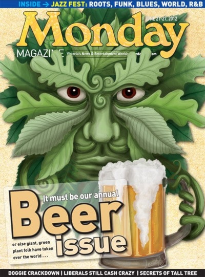
Among the group is Michelle Landry, who created this week’s beer-themed Monday cover.

Over the last year, Landry has designed four bomber labels (Belgian White, Belgian Black, Dark Chocolate Porter and Uncharted IPA) and two six-packs (Switchback IPA and Tasman Ale) for Lighthouse. Other local artists who’ve worked for Lighthouse include Ken Faulks (Shipwrecked), Marty Machacek (Navigator), tattooist Ryan Tree (whose design for Deckhand was digitized with help from Ken Faulks) and Eliska Gachinha of EFOX (Overboard).
“They found me online and contacted me out of the blue,” says Landry. “I do enjoy local craft beers, and it’s pretty cool having my artwork printed on glass. I had never had any of my art screen printed on anything like that before.”
Landry is a self-taught illustrator who has a degree in earth and ocean sciences from UVic. As a professional artist, Landry’s work includes books, websites, pamphlets, logos, packaging and more and is heavily influenced by her love of all things fantastical.
“I really enjoy both the sense of freedom and collaboration working with Lighthouse,” says Landry. “They give me a name and a theme and just tell me to go to it. They don’t like to interfere with the artist’s process.”
In the case of the Switchback IPA, Fitterer says the team at the brewery came up with the mountain bike concept and let Landry take it from there. Now her design is riding the side of a BC Transit bus in town.
“We’re all avid mountain bikers,” says Fitterer. “We have more bikes in our lot than cars, so we thought it would be a good fit. We gave the concept to Michelle and she gave us back a great label.”
“[Having local artists design the labels] offers much the same benefit as buying local beer,” says Fitterer. “We like to have everything as local as possible, our beers, our employees, our ingredients, we just firmly believe in supporting local in any way we can.” M